Thursday 27 June 2013

Sci Fi Drone - Example of Movement

As mentioned in my previous post, I have made a small concept that shows the movement of the drone and how it might defend itself.  This is an additional illustration to the previous Orthographic Concept which allows a modeller to understand parts of the drone that will be rigged during the animation process, possibly resulting in changes to the model.

As you can see, from the concept, the front plates rotate upwards to defend the single eye which is the weakest part of the drone (the rest of the drone is armour plated).  To finish the concept off I might develop and produce a final illustration which shows the drone in action and full colour.  If I do make a final illustration I will put it up for sale on my Society6 page as a print.


Also, as you might have noticed, I have finally chosen a name for the drone so that it is no longer know as the "Sci Fi Drone - Shrimp Design" but is now named the "Seeker Drone".

Wednesday 26 June 2013

Sci Fi Drone - Colour Variations and Orthographic Drawing

 After selecting my "Shrimp" design I have started to experiment with the potential colour variations of the concept.  I quite like the simple designs close to the top of the page and I like the idea of having different drones for different environments. 

The final design at the bottom right is a little bit more extravagant and something of a joke.  However if the design was more comedy based I might add a sad / happy face to the front of the design to add humour.

Looking at these designs I prefer the simpler colours rather than the more complex patterns.  I think that the design is complex enough without having the pattern take over and become more important.
Having finally selected my design I needed to creating an image that could be used by a 3D CGI modeller as reference.


I took the design choices from the side and front view and then added in a top view resulting in an orthographic image that will give a CGI modeller all the information they need for modelling the drone.

I've kept the drawing quite simple so that it is easier to understand and won't give the modelling team too many problems.  Of course I have to consider that during the modelling process the concept is subject to change, however the overall design should be the same.  I may also include an additional concept showing the movement of the drone (particularly the front plates which protect the single eye) and maybe a brief description of what the drone does and how it behaves.  All of these things might aid the modelling of the drone and help to give it a personality despite being a machine.

Monday 24 June 2013

"The Rain Man" - Illustration

Thomas Gomes "The Rain Man" 2013
Apparently it's summer here in the UK...After a couple of really bright, sunshine, clear sky days, it is now really dark and raining.

In the spirit of this wonderful weather I have made a new illustration "The Rain Man".  I imagine this illustration being used as a stock image for weather or forecasts.  I have stayed with the blue hues of the colour spectrum to push the idea of the dark and cold that the UK is experiencing at the moment.  I've added the yellow colour in the sun pattern, this helps to create a contrast between the blue umbrella and the golden suns.

If you're interested in using this image then please contact me using the "Contact Me" form on the right.

As always, feel free to leave comments and thoughts.  Also consider sharing this post on Facebook, Twitter or Google +, thanks.

Wednesday 19 June 2013

"I love Coffee" - Illustration

Thomas Gomes "I love Coffee" 2013
Although I'm not so keen on coffee I realize that a vast majority of people in the world, particularly illustrators, do drink it on a regular basis.  So I decided to do an illustration based on the love that people show to coffee.

To make this illustration I made an ink drawing over a pencil sketch and then scanned it in using my new scanner.  Next I imported the ink drawing into Photoshop and worked on the drawing from there.  I've based the colours on those found in coffee, but I've also included the coffee bean in the middle of the cup to further suggest the subject matter.  The heart is there to reinforce the idea of love and attachment that people feel towards this drink.

I found that adding my own paper textures into the illustration helped to make the drawing more visually interesting. 

If or when I make the next version (most likely tea) I will try to use the same composition in the hopes of making a series of "hot drink "illustrations rather than just a one off drawing.

Sunday 16 June 2013

Sci Fi Drone - Final selection and variations

I really loved the "Shrimp" design and felt that there were more development possibilities.

So, in developing my "Shrimp" design, I have created three front elevations of the concept.  The first one (going left to right) has only a single eye and two plates that offer protection, the middle design is a single, flat plate and the third design has multiple eyes and protective plates.  I personally like the first variation,  I feel as though the protective plates would move to intercept bullets before it hit the single eye in the centre.  Those are the three options for this design.  After I have selected a Drone face I will continue to develop the design, looking next at colours and patterns!  As always I am very interested in people's thoughts and opinions; feel free to comment below and share this post and blog on multiply social networks.

Wednesday 12 June 2013

Final development of Sci Fi Drones

Here are the three finished concepts for the Sci Fi Drone, now labeled as 1,2 and 3. 

As you can see these designs are more developed than the simple silhouettes that they started off as.  With each concept I started with my basic silhouette and then began rendering it in gray scale.  If I want to experiment with colour and patterns I can do this at a later date.  At this point I would ask the client to choose a favourite design and then continue to develop the concept.  My personal favourite is number 2.  I love the almost jellyfish/turtle way this concept has developed, although I still love the "Shrimp" like shape of design number 1.  I'm very interested in people's thoughts and opinions so please feel free to contribute and share this blog post via Twitter, Facebook and Google+.

Monday 10 June 2013

Development of Sci Fi Drones

Concepts in development progress
So, having created a large sheet featuring around 20 different silhouette concepts (original post here), I have decided to develop three of the designs based on some feedback that I received.  The three favourite designs were number 2, 3 and 13.  Number 2 was particularly popular and was likened to a shrimp! 

Now that I have three silhouettes chosen I put them into a new document and then separated them into different layers, re-labeling them as 1, 2 and 3.  I choose my first concept, tidy up the silhouette and start painting in black and white (I can add colour later on...) allowing me to further suggest detail and giving the silhouette more personality.  Once I have done this to all three designs the client can choose a single design which they want developed.  When the design is chosen I can develop it further and eventually make an Orthographic concept page for 3D modelling...

Sunday 9 June 2013

Concept by Silhouette - Sci Fi Drones

Here are some concept designs that I have done for a science fiction (Sci Fi) flying drone.  I gave myself certain constraints to generate a specific type of drone.  I wanted the drone to have small mechanical arms (for picking up and moving material) and an antenna of some kind for communication.  As you can already see design number 7 doesn't fit into these constraints making it standout like a sore thumb.  Also designs 3 and 4, don't have antennas.  I mostly used these designs to help generate other ideas; you can see how designs 12 and 16 are very similar to 7.

Making concepts by silhouettes is a really quick and easy way to generate a lot of concepts in a short amount of time.  The more concepts you make the more options and various that you have the potential for developing.  It also gives the client more options to choose from, there might even be different elements from different designs which a client likes.  For example you might like design 10, but you want it to have elements of design 6 in it.

To make the silhouettes all you need to do is block colour (with a normal brush) onto a blank canvas.  Then, using the eraser tool, I have added details to the silhouettes to give the designs more interest and make suggestions as to have it works.

I'm hoping to develop some of these designs further and I'm very interested to see what you think of them.  Try picking out your three favourite designs and posting a comment below.

Tuesday 4 June 2013

My First Self Portrait

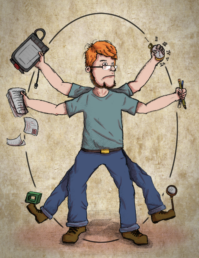
Thomas Gomes "Self Portrait - Imperfect Man" 2013
I've never attempted to create a self portrait before because I didn't really know where to start...

Thanks to a project that I'm working on in my degree course I had the opportunity to do a self portrait.  Also I feel, seeing as this is my first official post on this blog, that  I would like to share a little of myself with you! 

First, it's worth nothing, that I didn't take a realistic approach to my portrait (the four arms and four legs is a big give away), but each item tells a little bit about my personality.  The watch represents my time keeping abilities, the pens and pencils as my use of physical materials, the magnifying glass is my researching and critical approach to work, the odd cube is my skills in 3D CGI, the papers are my ability to write and explain my ideas and work, finally, the graphics tablet, is my skills in Photoshop and general digital understanding...

Leonardo Da Vinci "Venetian Man" taken from:  http://eccentricparabola.blogspot.co.uk/2012_06_01_archive.html on 04/06/2013
You may recognize what my self portrait looks like and you would be right.  I based my design off of Leonardo Da Vinci's "Venetian Man" which is considered to be the perfect man.  Now, I realize that I am FAR from perfect, so I approached this self portrait with a little bit of cynicism.  For example rather than a perfect circle for the proportions I chose to do an oval and my cartoon style makes it more a parody than anything else.  I've also titled it as "Self Portrait - Imperfect Man" because perfect people don't exist, and I think they never will. 

Please leave comments and thoughts on this post.

Challenge!


Consider doing your own self portrait.  Try populating your portrait with items that describe you, maybe you like sports and want to add sport equipment or, if you're an artist, the mediums that you favour.  Why not ask others what they think about you?  Maybe convince them to do their own self portrait and compare them!