Sunday, 13 October 2013

Illustration - Guitarist (Colour My World)

Thomas Gomes "Guitarist (Colour My World)" 2013
With the new release of Rocksmith coming out very soon, I thought I would make an illustration to show how music can colour your world.  It doesn't matter what kind of music you listen to, as long as you enjoy it and it makes you feel happy!

So, as usual, this illustration started as a simple sketch which evolved into a final piece through the use of INK!  I then used a combination of the layer types and some clever masking to create the effect you can see.

I really like this illustration.  I've been trying to push my style of illustration to the limits and, so far, I think it's working well.

If you are interested in using this illustration then please use the "Contact Me" form on the right (below the blog archive).

Also, if you would like this design on a t-shirt, iphone case or as a print, then please visit my Socity6 Page

Thursday, 26 September 2013

Illustration - Alternative Travel

Thomas Gomes "Alternative Travel" 2013
I've had this idea for a couple of weeks now and ended up scribbling it in my sketchbook of; a boat being pulled along by a balloon, almost like an alternative to sails.

Anyway, so I had this idea sitting in my sketchbook and came across it yesterday, I really liked it and wanted to develop it into a full, completed illustration.  I did what I usually do, making a pencil version on thick paper and then overlaying it with black ink before scanning it into the computer and editing it in photoshop.  I did have a problem with the ocean.  I wanted to have a texture which complimented the rest of the illustration, but also linked in well with the ocean.  I found a photo texture I had taken a couple of years ago of some rocks and added it into the illustration using the "Overlay" layer mode.  I'm very pleased with the result and would be happy with any feedback people could offer.

If you would like to use this image then please use the "Contact Me" panel on the right side of the blog.  Also, if you would like this illustration on a t-shirt, laptop skin or as a print on canvas then go to my Society6 page here.

Wednesday, 25 September 2013

Stock Image - Feet

Thomas Gomes "Feet" (Stock Image) 2013
So I was working on a logo design for my Dad's reflexology business and wanted to create a pair of feet as a background or even as the logo for the business.

Ultimately he wanted to go for a different logo design but I still really loved the look of these feet.  Originally the feet were just black and white with a blank background but, seeing as I was putting the design up on my blog, I wanted to edit the illustration in my style.

I consider this sort of illustration as a "Stock Image" in that it can have several uses in various situations and doesn't have a specific meaning or idea to convey.  For example, if you wanted an image for a leaflet about caring for your feet or, like my Dad, you wanted to have a design of some kind for reflexology.  The illustration is designed to be used by different people with different needs.

If you are interested in using this image please use the "Contact Me" box on the right of the blog.

Also, just a general update, I'm going to be returning to my illustration degree course at the end of September so it might be a little bit quiet on this blog for a while.  However I do intend to update the blog as much as possible with the work I have made on my course.

Thursday, 5 September 2013

Illustration - Outer Space

Thomas Gomes "Outer Space" 2013
Thanks to my brother I have been able to get another illustration done!  This illustration started life as a doodle my brother did while he was at work, he gave it to me to do it professionally.

As with my other illustrations I started with an initial pencil sketch which I inked and then scanned into the computer.  Next, using photoshop, I added the colour layer, shading and highlight as well as a couple of paper textures. 

The lighting was a bit of a problem with this illustration.  My brother wanted the drawing to have radial light coming from the sun and the earth.  With the sun it was easy, gradually decreasing the saturation and opacity of the yellow colour until it faded out.  However, when I tried it with the earth, it didn't work.  Instead I've worked backwards having the lighting, less saturated colour closer to the black outline which gradually gets more saturated but more transparent as it fades away.

Interested in getting this artwork as a print, laptop case or t-shirt?  Go HERE for my society6 page!

Tuesday, 16 July 2013

Illustration - "It's Not Easy Being Green"

Thomas Gomes "It's Not Easy Being Green" 2013
I've been watching a lot of movies and games recently that revolve around zombies or infected.  I couldn't help but do a small illustration of zombies!  As with most of my drawings it started off as a sketch which I then developed into a final drawing. 

The tag line "It's Not Easy Being Green" was added in later, after I had finished the initial drawing.  As usual I am sticking to a certain style of illustration which I'm finding more and more uses for.  I'm interested in any comments that people have on this illustration and particularly the style of illustration that I'm employing here.

Monday, 15 July 2013

Sci Fi "Seeker Drone" Texturing

Been a while since I've made an update on my Sci Fi drone project.  Over the passed couple of weeks I've been slowly editing and polishing up the textures and materials of my drone.  The first image is the basic material, a brushed chrome with some scratches here and there.  You will notice the photo background behind the drone which I'm using to create HDR lighting, this helps to give a realistic look to my drone.  I have finished with the eye lens which is looking really nice with the lighting but the main body of the drone is still incomplete, I haven't decided what I want to do with it and how I want to texture it. 

From my previous post on colour variations (which can be found here) I have decided to go with the bronze, brown colour design, although I still think that the drone would be designed to have different paint jobs depending on the environment it will be working in, however, for now I like the bronze effect.  The scratches are far more noticeable now that I've added a different colour and the drone has a nice weathered effect.  I'm still not sure what I will do with the body, but I'll think of something eventually!

I'm very interested to see what people think so far.  I'm particularly interested if you have any suggestions on what I should do with the body.  Leave comments below and consider sharing this post on Twitter, Facebook and Google+.

Wednesday, 3 July 2013

US Spying on EU - Editorial Illustration

----- Based on this news article from the BBC News website -----

After listening to the news and reading the above article I decided to do an editorial illustration based on the allegations that the US has been spying on the EU.  In the article it talks about how trade talks with the US has helped to soften the anger that the EU is feeling.

Thomas Gomes "US Spying on EU" (Editorial) 2013
So here is the illustration.  As you can see the American (Uncle Sam) and member of the EU (The old, bald man in grey) are at a poker table.  Uncle Sam is pushing money toward the EU (representing the trade talks) and is using a mirror to see what cards the EU member is holding (representing the NSA spying on the EU).  It's quite a simple illustration but I think it works well.  I find that the most important thing about an editorial illustration is to show a story visually but not make the article redundant.  I'm hoping that it's not immediately obvious what the drawing is about, particularly the imagery of the mirror and the money being moved.  I want the audience to use their prior knowledge and the information in the article to understand the illustration and give it some context.

Tuesday, 2 July 2013

Sci Fi "Seeker Drone" 3D model

Using my Orthographic illustration of my "Seeker Drone" I have completed the 3D CGI modeling stage of my Sci Fi drone.  The first image included in this post is a screenshot of my workspace on my computer.  I have a dual screen set up which I use for modeling and reference.  As you can see from this screenshot I have used
one screen for the orthographic illustration and another screen to work in Blender 3D on the modeling of the drone. 

As I have modeled the drone I have rigged it for animation, something that I'm quite keen to produce and post here at a later date.

The final image in this post is an Orthographic representation of my 3D CGI "Seeker Drone".  Each part of this image is an individual render of the drone before any materials or textures have been added, except the glowing light to represent the eye lens.

It is worth mentioning that the drone is not finished yet.  The modeling is complete but I want to add textures and materials to the drone to make it look more realistic and give it some personality.  This is where my previous post on colour variations will help me to develop the textures and the finish of the drone.

From Illustration to Game development

Just listening to a very interesting podcast on the "Mature Gamer Podcast" website.  The game developer that they are interviewing is called Ben Rivers who made the horror game "Home".  The reason I am making a post on this blog is because Ben Rivers' education is in graphic design and illustration.  Having this education background has enabled him to do several jobs, however the most recent job is developing a game.  This really shows how broad illustration and graphic design can be, and how easy it is to apply your skills to any job!  Anyway here is a link to the podcast itself.

It's worth checking out Ben Rivers website and having a look at his illustration work as well as his game development work.

Thursday, 27 June 2013

Sci Fi Drone - Example of Movement

As mentioned in my previous post, I have made a small concept that shows the movement of the drone and how it might defend itself.  This is an additional illustration to the previous Orthographic Concept which allows a modeller to understand parts of the drone that will be rigged during the animation process, possibly resulting in changes to the model.

As you can see, from the concept, the front plates rotate upwards to defend the single eye which is the weakest part of the drone (the rest of the drone is armour plated).  To finish the concept off I might develop and produce a final illustration which shows the drone in action and full colour.  If I do make a final illustration I will put it up for sale on my Society6 page as a print.


Also, as you might have noticed, I have finally chosen a name for the drone so that it is no longer know as the "Sci Fi Drone - Shrimp Design" but is now named the "Seeker Drone".

Wednesday, 26 June 2013

Sci Fi Drone - Colour Variations and Orthographic Drawing

 After selecting my "Shrimp" design I have started to experiment with the potential colour variations of the concept.  I quite like the simple designs close to the top of the page and I like the idea of having different drones for different environments. 

The final design at the bottom right is a little bit more extravagant and something of a joke.  However if the design was more comedy based I might add a sad / happy face to the front of the design to add humour.

Looking at these designs I prefer the simpler colours rather than the more complex patterns.  I think that the design is complex enough without having the pattern take over and become more important.
Having finally selected my design I needed to creating an image that could be used by a 3D CGI modeller as reference.


I took the design choices from the side and front view and then added in a top view resulting in an orthographic image that will give a CGI modeller all the information they need for modelling the drone.

I've kept the drawing quite simple so that it is easier to understand and won't give the modelling team too many problems.  Of course I have to consider that during the modelling process the concept is subject to change, however the overall design should be the same.  I may also include an additional concept showing the movement of the drone (particularly the front plates which protect the single eye) and maybe a brief description of what the drone does and how it behaves.  All of these things might aid the modelling of the drone and help to give it a personality despite being a machine.

Monday, 24 June 2013

"The Rain Man" - Illustration

Thomas Gomes "The Rain Man" 2013
Apparently it's summer here in the UK...After a couple of really bright, sunshine, clear sky days, it is now really dark and raining.

In the spirit of this wonderful weather I have made a new illustration "The Rain Man".  I imagine this illustration being used as a stock image for weather or forecasts.  I have stayed with the blue hues of the colour spectrum to push the idea of the dark and cold that the UK is experiencing at the moment.  I've added the yellow colour in the sun pattern, this helps to create a contrast between the blue umbrella and the golden suns.

If you're interested in using this image then please contact me using the "Contact Me" form on the right.

As always, feel free to leave comments and thoughts.  Also consider sharing this post on Facebook, Twitter or Google +, thanks.

Wednesday, 19 June 2013

"I love Coffee" - Illustration

Thomas Gomes "I love Coffee" 2013
Although I'm not so keen on coffee I realize that a vast majority of people in the world, particularly illustrators, do drink it on a regular basis.  So I decided to do an illustration based on the love that people show to coffee.

To make this illustration I made an ink drawing over a pencil sketch and then scanned it in using my new scanner.  Next I imported the ink drawing into Photoshop and worked on the drawing from there.  I've based the colours on those found in coffee, but I've also included the coffee bean in the middle of the cup to further suggest the subject matter.  The heart is there to reinforce the idea of love and attachment that people feel towards this drink.

I found that adding my own paper textures into the illustration helped to make the drawing more visually interesting. 

If or when I make the next version (most likely tea) I will try to use the same composition in the hopes of making a series of "hot drink "illustrations rather than just a one off drawing.

Sunday, 16 June 2013

Sci Fi Drone - Final selection and variations

I really loved the "Shrimp" design and felt that there were more development possibilities.

So, in developing my "Shrimp" design, I have created three front elevations of the concept.  The first one (going left to right) has only a single eye and two plates that offer protection, the middle design is a single, flat plate and the third design has multiple eyes and protective plates.  I personally like the first variation,  I feel as though the protective plates would move to intercept bullets before it hit the single eye in the centre.  Those are the three options for this design.  After I have selected a Drone face I will continue to develop the design, looking next at colours and patterns!  As always I am very interested in people's thoughts and opinions; feel free to comment below and share this post and blog on multiply social networks.

Wednesday, 12 June 2013

Final development of Sci Fi Drones

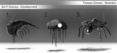
Here are the three finished concepts for the Sci Fi Drone, now labeled as 1,2 and 3. 

As you can see these designs are more developed than the simple silhouettes that they started off as.  With each concept I started with my basic silhouette and then began rendering it in gray scale.  If I want to experiment with colour and patterns I can do this at a later date.  At this point I would ask the client to choose a favourite design and then continue to develop the concept.  My personal favourite is number 2.  I love the almost jellyfish/turtle way this concept has developed, although I still love the "Shrimp" like shape of design number 1.  I'm very interested in people's thoughts and opinions so please feel free to contribute and share this blog post via Twitter, Facebook and Google+.

Monday, 10 June 2013

Development of Sci Fi Drones

Concepts in development progress
So, having created a large sheet featuring around 20 different silhouette concepts (original post here), I have decided to develop three of the designs based on some feedback that I received.  The three favourite designs were number 2, 3 and 13.  Number 2 was particularly popular and was likened to a shrimp! 

Now that I have three silhouettes chosen I put them into a new document and then separated them into different layers, re-labeling them as 1, 2 and 3.  I choose my first concept, tidy up the silhouette and start painting in black and white (I can add colour later on...) allowing me to further suggest detail and giving the silhouette more personality.  Once I have done this to all three designs the client can choose a single design which they want developed.  When the design is chosen I can develop it further and eventually make an Orthographic concept page for 3D modelling...

Sunday, 9 June 2013

Concept by Silhouette - Sci Fi Drones

Here are some concept designs that I have done for a science fiction (Sci Fi) flying drone.  I gave myself certain constraints to generate a specific type of drone.  I wanted the drone to have small mechanical arms (for picking up and moving material) and an antenna of some kind for communication.  As you can already see design number 7 doesn't fit into these constraints making it standout like a sore thumb.  Also designs 3 and 4, don't have antennas.  I mostly used these designs to help generate other ideas; you can see how designs 12 and 16 are very similar to 7.

Making concepts by silhouettes is a really quick and easy way to generate a lot of concepts in a short amount of time.  The more concepts you make the more options and various that you have the potential for developing.  It also gives the client more options to choose from, there might even be different elements from different designs which a client likes.  For example you might like design 10, but you want it to have elements of design 6 in it.

To make the silhouettes all you need to do is block colour (with a normal brush) onto a blank canvas.  Then, using the eraser tool, I have added details to the silhouettes to give the designs more interest and make suggestions as to have it works.

I'm hoping to develop some of these designs further and I'm very interested to see what you think of them.  Try picking out your three favourite designs and posting a comment below.

Tuesday, 4 June 2013

My First Self Portrait

Thomas Gomes "Self Portrait - Imperfect Man" 2013
I've never attempted to create a self portrait before because I didn't really know where to start...

Thanks to a project that I'm working on in my degree course I had the opportunity to do a self portrait.  Also I feel, seeing as this is my first official post on this blog, that  I would like to share a little of myself with you! 

First, it's worth nothing, that I didn't take a realistic approach to my portrait (the four arms and four legs is a big give away), but each item tells a little bit about my personality.  The watch represents my time keeping abilities, the pens and pencils as my use of physical materials, the magnifying glass is my researching and critical approach to work, the odd cube is my skills in 3D CGI, the papers are my ability to write and explain my ideas and work, finally, the graphics tablet, is my skills in Photoshop and general digital understanding...

Leonardo Da Vinci "Venetian Man" taken from:  http://eccentricparabola.blogspot.co.uk/2012_06_01_archive.html on 04/06/2013
You may recognize what my self portrait looks like and you would be right.  I based my design off of Leonardo Da Vinci's "Venetian Man" which is considered to be the perfect man.  Now, I realize that I am FAR from perfect, so I approached this self portrait with a little bit of cynicism.  For example rather than a perfect circle for the proportions I chose to do an oval and my cartoon style makes it more a parody than anything else.  I've also titled it as "Self Portrait - Imperfect Man" because perfect people don't exist, and I think they never will. 

Please leave comments and thoughts on this post.

Challenge!


Consider doing your own self portrait.  Try populating your portrait with items that describe you, maybe you like sports and want to add sport equipment or, if you're an artist, the mediums that you favour.  Why not ask others what they think about you?  Maybe convince them to do their own self portrait and compare them! 
 

Friday, 24 May 2013

Welcome to My Blog

Hello there and welcome to my blog.

My names is Thomas Gomes, I am currently an illustration student studying in the UK.

I hope you enjoy what you find here.  Over the coming months and years I hope to fill this blog with my work and help other illustrators to find inspiration.  I will be posting my own personal and commissioned work as well as links to what inspires me.